DAVID_DENG
Hi,
My Name is David
My Name is David
介绍:我的名字叫邓麒伟.今年23岁,这是关于我的个人网站,希望我的网站能够加深你对我的了解.
对电脑硬件(如CPU、GPU、主板等)有颇有研究,了解主流品牌及型号的性能特点,能够根据需求进行硬件选型与搭配.具备独立组装电脑的能力,能够完成硬件安装,系统配置及驱动优化,确保设备的最佳性能表现.能够定位并解决卡顿,蓝屏,死机等常见问题,提升设备的稳定性和运行速度.
对服务器有一定的了解,掌握内网服务器的搭建与配置,包括FTP文件传输服务的部署与优化,能够高效实现文件的上传,下载及权限管理.多种数据库的搭建与管理,包括MySQL,MariaDB和SQLite.
对网络安全有一定的了解,比如防火墙,加密等.了解HTTP、HTTPS、SSH,TCP,UDP等网络传输协议的原理与应用.
对计算机病毒有一定的了解,比如病毒的传播方式,病毒的危害,病毒的防范等等.
设计理念
这个网站使用HTML,CSS和JavaScript组成的网站.
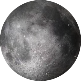
宇宙和星星一直对我很有吸引力,所以我创建了这个网站.希望更全面地展示我的个性.
联系方式
- :dqw38449@outlook.com
- :2229546800
- :dddwww1324
动态效果1[拉帘效果]
<style>
.Dynamic_effect{background:#1759e7;cursor:pointer;display:block;font-size:2em;padding:1em;margin:0 auto;text-align:center;text-shadow:0 1px 2px #000;box-shadow:1px 1px 2px gray;box-sizing:border-box;position:relative;width:400px}.Dynamic_effect a{color:#fff;text-decoration:none}.Dynamic_effect::before,.Dynamic_effect::after{color:#fff;transition:all 1.2s ease;position:absolute;overflow:hidden;background:#1775e0;width:50%;padding:1em 0;top:0}.Dynamic_effect::before{text-align:right;content:'动态';left:0}.Dynamic_effect::after{text-align:left;content:'效果';right:0}.Dynamic_effect:hover::before,.Dynamic_effect:hover:hover::after{width:15%;color:#1775e0}
</style>
<html>
<span class="Dynamic_effect"> <a href="">动态效果1[拉帘效果]</a> </span>
</html>
<style>
.Dynamic_effect2{background:#000;cursor:pointer;font-size:2em;padding:.3rem;margin:10px auto 10px auto;text-align:center;border-radius:3px;box-shadow:.5px -.5px 4px 2px #31e0e0;width:200px;transition:all 1.5s ease}.Dynamic_effect2:hover{background:#e7cb29;color:#000;box-shadow:0 0 1px 4px #31e0e0}
</style>
<html>
<div class="Dynamic_effect2">动态效果2</div>
</html>
<style>
.Dynamic_effect3{background:#fff;font-size:2em;padding:.3rem;overflow:hidden;position:relative;margin:10px auto;color:#000;border-radius:3px;width:200px;height:100px;outline:#fff solid 1px;transition:all .7s ease-in-out}.Dynamic_effect3::after{content:'';width:0;position:absolute;top:0;left:0;height:0;border-radius:100px;background-color:#000;opacity:0;transition:all 1.5s ease}.Dynamic_effect3:hover::after{content:'';transform:scale(5);opacity:1;width:200px;height:200px}
</style>
<html>
<div class="Dynamic_effect3">动态效果[暗色模式]</div>
</html>

<style>
.Dynamic_effect4{text-align:center;margin:20px auto;overflow:hidden;width:128px;height:140px}.Dynamic_effect4::after{content:'悬停展示文字';text-align:center;display:flex;justify-content:center;opacity:0;font-size:0;margin-top:10px;transition:all .2s ease-in}.Dynamic_effect4:hover::after{content:'悬停展示文字';opacity:1;font-size:1rem;margin-top:-10px}
</style>
<html>
<div class="Dynamic_effect4">
<img src="data:image/svg+xml;base64,PHN2ZyB4bWxucz0iaHR0cDovL3d3dy53My5vcmcvMjAwMC9zdmciIHdpZHRoPSIxMjgiIGhlaWdodD0iMTI4IiB2aWV3Qm94PSIwIDAgMTUgMTUiPjxwYXRoIGZpbGw9Im5vbmUiIHN0cm9rZT0iI2ZmZmZmZiIgZD0ibTIuNSAyLjVsMiAzbTgtM2wtMiAzTTQgOS41aDFtNSAwaDFtLTkuNSAzdi0yYTYgNiAwIDEgMSAxMiAwdjJ6Ii8+PC9zdmc+">
</div>
</html>
<style>
.Dynamic_effect5{text-align:center;font-size:1.5rem;margin:20px auto;overflow:hidden;width:300px;height:150px;display:flex;align-items:center;justify-content:center;border:5px solid #fff;border-image:linear-gradient(45deg,red,#0f0,#00f) 1;animation:border_an infinite 3s linear}@keyframes border_an{0%{filter:hue-rotate(0deg)}to{filter:hue-rotate(360deg)}}
</style>
<style>
.Dynamic_effect6{text-align:center;font-size:1.5rem;margin:20px auto;overflow:hidden;width:300px;height:150px;position:relative;display:flex;align-items:center;justify-content:center;z-index:1;border-radius:10px}.Dynamic_effect6::before{content:'';width:40px;height:336px;z-index:-1;background:linear-gradient(#f01bf0,#0eccf7);transform:rotate(0deg);transition:all .4s linear;filter:hue-rotate(0deg)}.Dynamic_effect6:hover::before{transform:rotate(180deg);filter:hue-rotate(360deg)}.Dynamic_effect6::after{content:'动态效果6[线性跟随边框走动(流动边框)]';position:absolute;top:3px;left:3px;width:294px;height:144px;background:#000;display:flex;align-items:center;z-index:0;border-radius:10px}
</style>
<html>
<div class="Dynamic_effect6"></div>
</html>
<style>
.Dynamic_effect7{text-align:center;font-size:1.5rem;margin:20px auto;overflow:hidden;width:300px;height:150px;position:relative;display:flex;align-items:center;justify-content:center;z-index:1;border-radius:10px}.Dynamic_effect7 div{width:15px;height:15px;margin:10px;border-radius:8px;opacity:.8;background:#fff;animation:ball_an1 infinite 3s ease-out}.Dynamic_effect7 div:nth-child(1){animation-delay:-1s}.Dynamic_effect7 div:nth-child(2){animation-delay:-.8s}.Dynamic_effect7 div:nth-child(3){animation-delay:-.6s}.Dynamic_effect7 div:nth-child(4){animation-delay:-.4s}.Dynamic_effect7 div:nth-child(5){animation-delay:-.2s}.Dynamic_effect7 div:nth-child(6){animation-delay:0s}@keyframes ball_an1{0%,to{transform:scale(1);opacity:.8}50%{transform:scale(1.5);opacity:1}}
</style>
<html>
<div class="Dynamic_effect7"><div></div><div></div><div></div><div></div><div></div><div></div>
</div>
</html>
动态效果2[按钮效果]
动态效果5[线性边框渐变颜色]